
Design Line: 17 - 23 February

From golden syrup to golden shoes, this week’s Design Line ponders how the language of design is being co-opted for political messages, as well as including stories about material tracing, manufactured outrage and un-radical retrofitting. Read on to find out more.
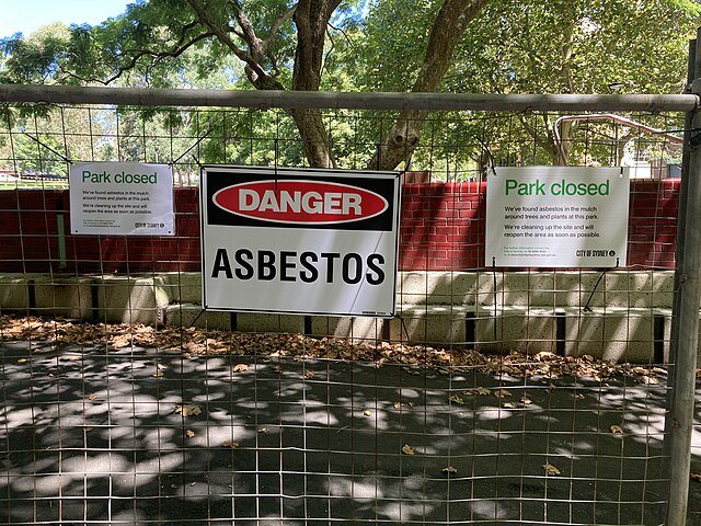
Asbestos signage on fencing in Harmony Park, Sydney, following the discovery of asbestos-contaminated mulch (image by DraftSaturn15 via Wikimedia Commons).
Mis-managed mulch
If you were to venture to a park or school in Sydney this week, your experience would likely be dominated by temporary fencing cordoning off trees, pathways, play areas and more, with signs reading “DANGER: ASBESTOS”. The fencing is a temporary measure that has been put in place to safeguard the public against the ever-growing number of sites across New South Wales where recycled mulch, used in landscaping, is being found to contain asbestos. What began on 8 February as an investigation into five locations that were suspected of being contaminated, swelled into a much larger public health issue, with 41 locations across the state (to date) having now tested positive for asbestos and more locations currently undergoing testing (updates can be found here). Where the asbestos contamination has come from is yet to be determined and the state has now established a taskforce to investigate this: “The government’s number one priority is ‘contact tracing’ down the complex supply chain,” reads the taskforce’s website. The short-term implications include limited access to public spaces, closure of schools, and the cancellation of events on contaminated sites such as Fair Day, which marks the beginning of Sydney’s Mardi Gras. The long-term health and environmental consequences, however, remain uncertain at this stage. The escalating problem is a stark reminder that the materials we build with can have serious consequences for years to come and impact our lives in unexpected ways. Recycling systems must take now-banned materials into account going forward.

Christien Meindertsma is removing the wool from the design industry’s eyes one research-led project at a time (image by Negin Zendegani, courtesy of NGV).
Where there’s a wool there’s a way
Christien Meindertsma has always been fascinated by wool – where it comes from, our perceptions of it, and why so much of it is discarded. In 2010, for example, her project One Sheep Sweater shone a light on the role of individual sheep in supply chains. Then there was Fibre Market in 2016, followed by Fibre Market - Donegal Tweed (2017), Saddle Blanket (2020), Journey of a Sheep’s Fleece (2020), Block Wool (2022) and most recently FLOCKS Wobot (2023) – a robotic 3D printing technique utilising so-called “waste” wool. Rethinking material supply chains is hugely important work, but it is also work that requires a large investment of time, access to resources and, consequently, money. This can be a challenge as research-led projects don’t often come with a clear commercial output. As such, the role of institutions (and sometimes brands) in supporting this kind of design research is vital. FLOCKS Wobot, for example, was initially funded by the V&A and the Cuypershuis museums. This week, the National Gallery of Victoria announced that Meinderstsma will continue developing this project to produce a “large-scale form” as the recipient of its 2024 Women in Design Commission. “This opportunity,” reflected Meindertsma, “will allow me to explore and push the possibilities of wool as a strong and at the same time soft material, in directions it has not gone before.” Meindertsma’s practice (read more about it in Disegno #17) is interesting, then, not only for its subject matter, but also how she has found ways to sustain it.

The horror of it all (image via @trumpsneakers, X).
Product roundup
It has, it is fair to say, been a mixed week for new products. There have been undoubted highlights (Framework’s launch of a $499 version of its celebrated modular laptop – bringing a repairable, adaptable design into more hands than ever), as well as interesting curios (Nendo’s rippling new pint glass for Sapporo, which sacrifices straightforward stackability on the altar of mouthfeel – drinking from different sides of the asymmetrical glass is supposed to alter the flavour and aroma of the beer). Yet it is difficult to escape the yawning horror of the week’s most prominent piece of new product design: Donald Trump’s Never Surrender High-Top sneakers. Beyond the sheer oddity of a likely presidential candidate touting $399 trainers (although it is, admittedly, far from the oddest thing that Trump has done), and the deep weirdness of a 77-year-old billionaire attempting to engage with sneaker culture, the design of the shoes themselves seems to perfectly encapsulate Trumpian values: they are crass, inane and childishly obsessed with the trappings of power and glory (“Lace-up and step out ready to conquer”). As a piece of inadvertent satire, the sneakers are a hit, but for those who have actually ordered the product, there is a warning. “The images shown are for illustration purposes only,” reads the trainers’ website, “and may not be an exact representation of the product.” In other words, brash presentation, covering up a lack of actual substance. Sound familiar?

The BT Tower, awaiting its Heatherwickian makeover (image by Ian Beales, via Wikimedia Commons).
Transform the tower
What use should London’s BT Tower be put to? If you answered “luxury hotel”, congratulations!, you and MCR Hotels think alike, with the US group having acquired the structure from BT in a £275m deal announced this week. Designed by architects Eric Bedford and GR Yeats, the BT Tower has been a landmark in London’s skyline since 1964, but the structure’s enduring physical prominence has masked its diminishing use as infrastructure. The building’s early ambitions to be public facing were steadily abandoned following a terrorist attack in 1971, while its uses within telecommunications have diminished as technology has advanced. The decision to retrofit the building to meet a new purpose is, then, no bad thing (although a hotel is hardly the most imaginative use), but much depends on the sensitivity with which this process is handled. MCR has already announced that Heatherwick Studio will oversee the redevelopment, with the studio likely to point to its work on Coal Drops Yard and Zeitz MOCAA as evidence of an interest in working with existing structures. Nevertheless, Heatherwick Studio is hardly known for the delicacy of its interventions (particularly in comparison to renovation specialists such as Lacaton & Vassal), and its most successful work (such as its Olympic Cauldron) has always been based around a certain theatrical chutzpah (read more about this in Design Reviewed #3). The studio is not an obvious fit for the commission, as critics on social media have been quick to point out – here’s hoping it can prove everyone wrong.

Lyle's Golden Syrup has replaced its logo of a body of a dead lion with a flatter, stylised head of a presumably alive one (image courtesy of Lyles Golden Syrup).
Lord of the flies
Hailing back to 1885, the logo for Lyle’s Golden syrup holds the Guinness World Record for the world’s oldest unchanged brand packaging. In a partial break from tradition, however, this week the company announced a new logo that will be rolled out across its squeeze bottles, breakfast bottles and portion packets. The old logo features the body of a dead lion (something that still surprises consumers today if the Disegno offices are anything to go by) surrounded by a swarm of bees, with a quote running underneath stating: “out of the strong came forth sweetness”. This logo was created by Abram Lyle, a strongly religious Scottish businessman, from the biblical story of Samson who killed a lion and returned later to discover a swarm of bees had made honey in the rotting body. The new logo replaces this with a stylised lion’s head with a single bee hovering above it. It retains a similar typeface, a background pattern taken from the original tin detailing, and is depicted in its familiar racing green and gold. The decision to rebrand was taken by the company to appeal to a younger generation of consumers. The tin version of the product will, however, keep the same logo, in order “to honour our original branding” according to James Whiteley, brand director for Lyle’s Golden Syrup. A new logo (and an alive lion), Whiteley hopes, will will “[bring] Lyle’s into the modern day, appealing to the everyday British household while still feeling nostalgic and authentically Lyle’s”.
Missing the mark?
Pointless controversy erupted amongst right-wing commentators this week (a familiar story…) after the discovery that Google’s Gemini AI tool, which can generate images, was producing imagery that depicted specific white figures (such as the US Founding Fathers) or groups including Nazi-era German soldiers as people of colour. Google was quick to accept the issues around Gemini introducing racial diversity into these images (“Gemini’s AI image generation does generate a wide range of people. And that’s generally a good thing because people around the world use it. But it’s missing the mark here”), but not before the story was seized upon by those keen to use it as a point of attack against the company. It is, clearly, a manufactured outrage. While some of the images generated by Gemini are undoubtedly flawed in their generation of an artificial diversity that does a disservice to actual histories of racial discrimination, it hardly seems the technology’s worst sin. AI image generation is notorious for its tendency to reinforce and exaggerate stereotypes, caused by the fact that the technology is trained upon image banks that frequently reflect the biases of those who created them. Any effort to address this issue, therefore, seems laudable, even if it clearly requires refinement in its application. There remains a long way to go to ensure that new technologies do not embody the failings of the past – a historically inaccurate shot of a Founding Father hardly seems a significant hiccough along the way.